| MASTER
/ DOCTORADO |
ANÀLISI
INTEL.LIGENT DE DADES I DATA MINING DATA MINING 2 |
There is a part of my Data Mining
course I am very fond of. This is Data Visualization, a matter often
overlooked when implementing DM processes and one -and this is my
contention- of extreme relevance to the whole enterprise.
The human visual system is an extremely subtle and beautiful natural
pattern recognition engine that, to our benefit, can be seamlessly
embedded within the human-crafted pattern recognition techniques. What
follows aims to be an ad hoc
repository of resources on data visualization. It is also meant to be a
showcase of my students' contribution to this part of the course.
Have a look at
these examples of excellence in data
visualization provided by this year's students (as
presented in the seminar 10/10/07). They are just a sample
of
how smart visualization can get in this Internet age:
1. When visualization rings you a bell
One
way to hit the bull’s eye in data visualization is by grounding it in a
directly unrelated way of visualization that, for whatever the reason,
is deeply ingrained in human visual reasoning. Chernoff’s faces
are an
example of that,
in which data attributes are coded as
facial features, expanding (at
least a bit) the possibilities of low-dimensional representations of
multivariate data.
A
really elaborated example, provided
by Javi Dolcet, is this representation of web trends for 2007 created by IA (Information
Architects, Japan), in which the underlying representation is Tokio’s metro map. Most of us,
urbanites, already know how to interpret a map such as this, despite
its complexity. A fully interactive version of this map can be found here
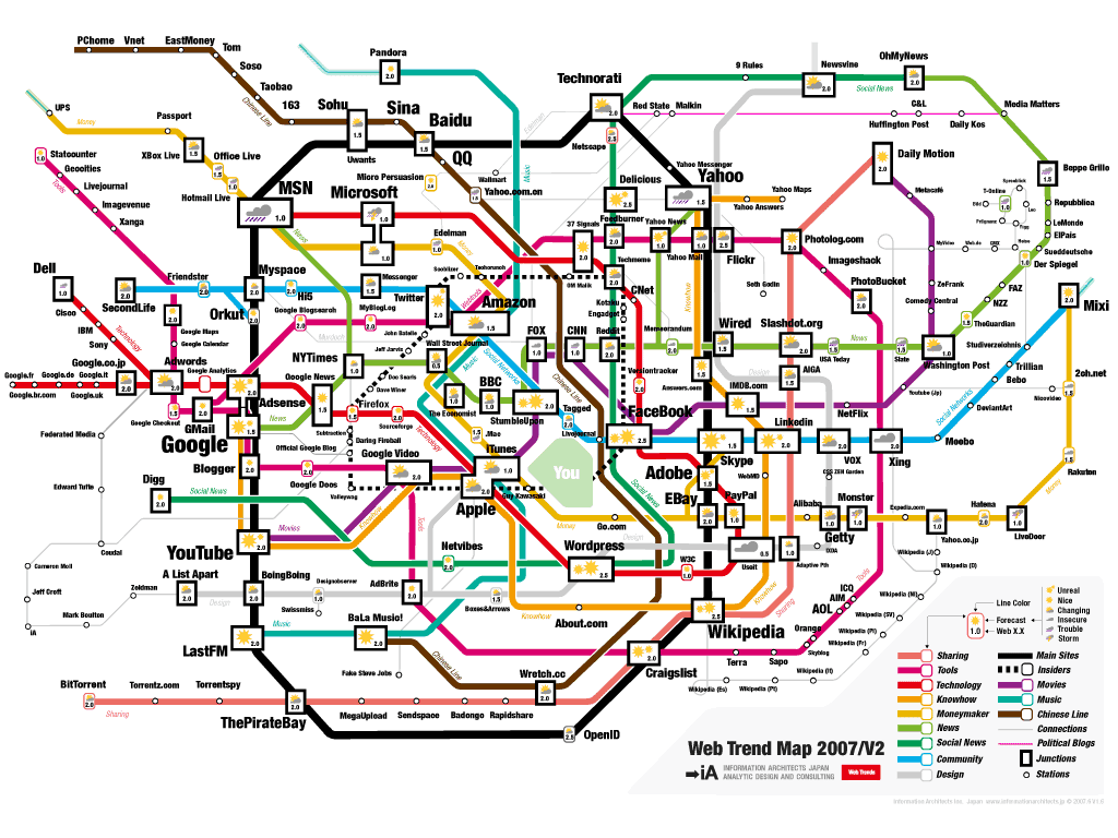
...
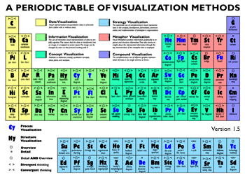
And a truly beautiful meta-example, provided
by Álvaro García, in which a palette of visualization methods are
themselves visualized using, as underlying representation, Mendeleev's periodic table
(which, by itself, is a great
visualization example). A fully interactive web version of the
table can be
found here.
2. Visualizing relationships
Guillermo Nebot
provided an example of visualization of social networks (by eye-sys, but given that the
company seems to have discontinued the product, we are not including
the image here). There is plenty of work on this type of visualization,
some of which is compiled here.
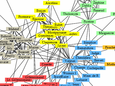
As an alternative example, have a look at this representation of the
interactions between characters in the novel Les Miserables by Victor
Hugo, divided in communities represented by different colors (by
M. Newman and M. Girvan, at University of Michigan, Santa Fe Institute,
Cornell University; USA)
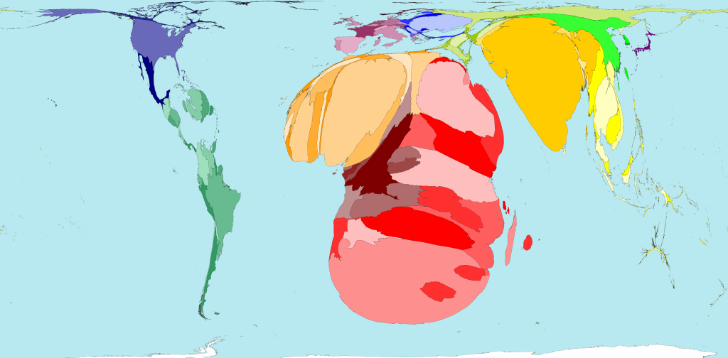
3. Geographies
Cartograms are a
nice way to use geographical information as the basis of data
representation. They can be defined as maps in which areas are
distorted according to a quantitative, area-related variable, and in
which map contiguity contrains are preserved. The following example,
representing HIV prevalence by nation, was presented by Ángela Chieppa,
and can be found here.